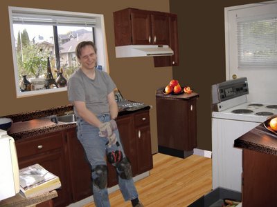
My friend Pol (she of the graphic-designer eye) has some inspiring software that is great for home inspiration ideas.
She sent me this picture today after I asked for kitchen ideas. She even kindly added in a bowl of virtual peaches.
I've really admired that dark contemporary look in other people's homes, but I just plum never envisioned it in my own kitchen.
It's a bit of a switch from the orange-and-plaid look, I'd say. The only thing is I'm not sure if I want to stain my oak cabinets...but I have to say I'd consider it now....
What do y'all think?
*****************************************************************************
Oh, and Blogger finally got back to me about my blog problem. The reason I see a big blank spot at the top of my blog before the text starts (on one computer but not the other which sits right beside it---yes, HIS and HERS computers are a necessity in my home) is that I haven't yet upgraded to the new Internet Explorer. How annoying.
So if you are one of the ones who see my blog with a large zen introduction, it can be remedied apparently.
12 comments:
At first, I didn't read the post and I was going like: wait a minute, those things look fake.
wow me
It's a big contrast with the flooring, but nice
Ooooh I like that!
After living with kids and various light shades of cupboards for 13 years,I'm a HUGE fan of the dark ones.
Very chic, though I never understand the appeal of granite counters. You can never see if they're clean!
You've lived with the kitchen for several years, but I have to say, I like the orange walls. Very cheerfu. The plaid wall paper really should go though.
Heh, I ran out just today and picked out bright white wainscoting and a really REALLY bright orangey-yellow colour that I admired in Spain.
Heh, if I end up hating it, I can always paint again. :)
I like it! Staining is a piece of cake, you should do it!
You should also upgrade. They actually did a good job with the new Internet Explorer.
I am with you, just finished renovations (sorta) in my kitchen. IT was awful!
Very pretty.
Hey Spider Girl!
I like the look of the proposed dark contemporary colours.
The only times my friends and I have painted our faces has been when one of us had passed out from excessive drinking and a Sharpie made its rounds (mostly profanity and phalluses...Boys are mean)...Or when KISS was big back in the late '70s/early '80s...I think it's great that your pals do the annual UnBirthday celebration!
Hopefully you're not too achy from all the working out...
Anyway, take care out there!
Your Pal,
Zambo.
I love the dark look you have there. I picture you liking bright colors, but little bits of color would go a long way in a kitchen with those colors (like the peaches). I say go for it.
You have me wondering about my kitchen, which I dispise. I have that software, but I have never tried it with a picture. Maybe I should because it really helps invision the look.
That is amazing!! And I love it.... I think you should maybe seriously consider it. Tawnya
Re: kitchen. No, I still like a combination of white with red oak cabinets and a moroccan leather-look counter. Color me old-fashioned. I once painted one wall of a kitchen bright lemon yellow, another wall in chrome yellow, and the wall leading into the dining/livingroom in burnt orange. And there were cedar shingles on the fourth wall. Really. Does that date me?
Re: blogger and IE. That's annoying. More annoying in that I have no -room- to upgrade, even if my system could handle it (lack of RAM, HD, ... and is it still baud?). I guess I'll continue to put up with it...
hugs,
Linda
Post a Comment